In web design and brand identity, color is the single most powerful tool for capturing user attention, establishing brand credibility, and conveying information hierarchy. A thoughtful, cohesive color palette sets the overall mood and guides the eye through the layout.
However, selecting colors purely based on aesthetics can introduce serious issues. Without proper planning, you risk creating accessibility barriers that prevent colorblind individuals, elderly users, or visually impaired visitors from reading your text or interacting with buttons. Modern web standards require building designs that are accessible to everyone. This guide reviews classical color harmony rules and details the contrast ratio guidelines defined in the Web Content Accessibility Guidelines (WCAG 2.1).
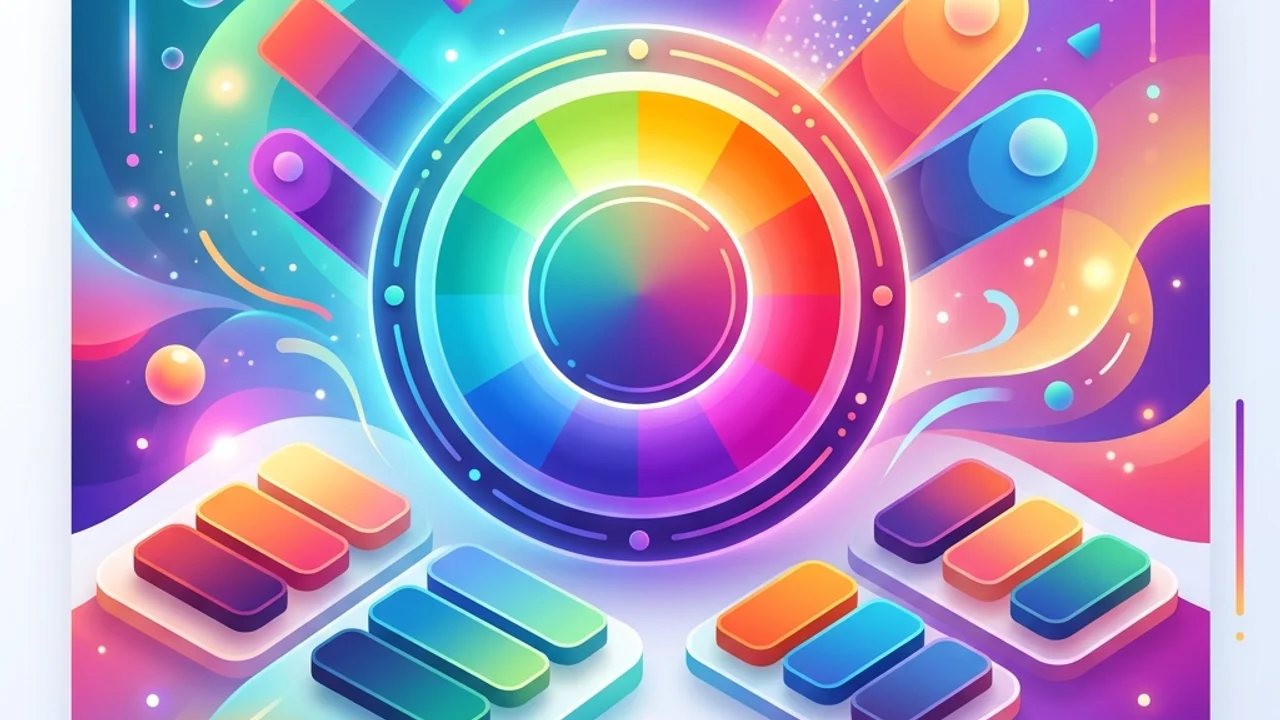
1. Classical Color Harmony Rules
To build balanced color palettes, designers refer to the color wheel. Here are the four most common color harmony techniques:
- Complementary: Combines two colors directly opposite each other on the color wheel. It creates high contrast, making it perfect for call-to-action (CTA) buttons, though it should be used sparingly to avoid eye strain.
- Analogous: Uses three adjacent colors on the wheel. It mimics palettes found in nature, producing a calm, cohesive design ideal for main branding schemes.
- Monochromatic: Focuses on a single hue, varying only its lightness and saturation. This yields clean, unified layouts that serve as the foundation for modern minimal designs and dark modes.
- Triadic: Utilizes three colors spaced evenly at 120-degree intervals. It offers a lively, colorful feel but requires adjusting the ratios (dominant, supporting, and accent) to prevent visual clutter.
2. Understanding WCAG 2.1 Contrast Ratio Standards
No matter how beautiful a palette looks, it is useless if the text is unreadable. The W3C's WCAG 2.1 specification measures contrast as a mathematical ratio comparing the relative luminance of foreground and background elements:
Level AA (Standard Compliance)
- Normal Text: Body text (under 18pt or 14pt bold) requires a minimum contrast ratio of 4.5:1 against the background.
- Large Text: Larger headings (18pt+ or 14pt+ bold) require a minimum contrast ratio of 3:1.
- User Interface Components: Active icons, input fields, and borders must maintain a 3:1 contrast ratio against the background.
Level AAA (Enhanced Compliance)
- Normal text requires 7:1 contrast, and large text requires 4.5:1 contrast to meet this strict standard, which is common for public sector and government websites.
This table summarizes the minimum contrast ratios required to satisfy WCAG 2.1 Level AA and AAA standards:
| Element Type | Physical Size Threshold | Level AA Minimum | Level AAA Minimum | Primary Inspection Targets |
|---|---|---|---|---|
| Normal Text | Under 18pt (24px) | 4.5 : 1 | 7 : 1 | Blog posts, card description copy, text blocks |
| Large Text | 18pt (24px)+ or 14pt bold | 3.0 : 1 | 4.5 : 1 | Page headings (H1, H2, H3), hero banners |
| UI Components | Buttons, form borders, active states | 3.0 : 1 | Recommended | Input borders, action buttons, status icons |
3. Best Practices for Accessible Color Design
Follow these three rules to build palettes that satisfy both visual beauty and technical standards:
- Prioritize Lightness Over Hue: Convert your palette to grayscale to test contrast. If the text does not stand out clearly in black and white, colorblind visitors will struggle to read it.
- Never Rely on Color Alone: When conveying critical information—like form errors or success states—always back up color changes with secondary cues. Combine a red outline with an error icon or explicit text description so color-deficient users can identify the error.
- Use Dimmed Overlays on Images: Placing text over a colorful photo or a gradient can cause contrast failures. Place a semi-transparent dark or light overlay between the background image and your text to protect readability.
4. Frequently Asked Questions (FAQ)
Q1. Is it easier to meet contrast guidelines in dark mode?
A1. Not necessarily. While using pure black (#000000) and pure white (#ffffff) yields a high contrast ratio, it causes visual "vibration" that tires the eyes. Dark mode designs should pair soft dark gray backgrounds with pastel hues, adjusting lightness to maintain the 4.5:1 ratio without causing glare.
Q2. Why is HSL preferred over HEX for designing palettes?
A2. HEX values like #FF0055 are hard to read visually. HSL separates color into Hue (0-360), Saturation (0-100%), and Lightness (0-100%). This makes adjusting contrast simple: if contrast is too low, you can adjust the Lightness value directly.
Q3. Do brand logos have to follow WCAG contrast rules? A3. No, brand logos and logotypes are exempt from WCAG contrast requirements. However, active menu icons, navigation links, and functional graphics on your site must still conform to the standards.
5. Generate and Verify Your Palette Instantly
Checking contrast values manually is tedious.
Streamline your workflow with our free Color Palette Generator. Explore color harmony models, extract HEX, RGB, and HSL codes in one click, and check contrast values easily. When creating graphics with your palette, consult our Social Media Image Size Guide to keep layouts within safe zones, and optimize loading speeds with our Image Compressor.
Recommended Reading
- Social Media Image Size Guide: Optimal dimensions for responsive layouts.
- Image Compression Guide: Compress web assets without sacrificing visual detail.